Background
I love a good gallery stroll, but often end up on a Google scroll
In my previous career iteration in Fine Art, I spent a lot of time walking the halls of New York's museums and galleries. Despite my love of art, I often spent more time with my eyes on my phone than on the work itself. Why? I am deeply interested in historical context. Unfortunately, that information is outside the scope of what a wall label can provide.
Context
GalleryPal enriches the experience of viewing art by putting all of a work's info at your fingertips
The physical space of a museum is limited, but the information available at our fingertips is not. This is both a blessing and a curse for patrons whose curiosities vary, but who don’t want to sift through the Google results page in order to find answers. GalleryPal aims to help patrons have the best experience by quickly finding the most relevant and interesting pieces of information for any given artwork.
Problem
Gallery patrons want more information than a wall label can provide
Solution
Quick and Simple Access
- use of AR technology to quickly scan the work in front of you
- Point. Scan. Learn.
Clean and Professional UI
- Reduce visual clutter


The Sprint
Day 2
Brainstorm Solutions
Activity/Deliverable: Competitive Analysis, Crazy 8 Sketches
At this stage, I looked for inspiration in other apps and began imagining the artwork landing page using Crazy 8s. I looked to Artsy to see how they were displaying artwork to the user, and to Night Sky to get a better idea of how I could incorporate AR into the user flow.
Inspo


Night Sky
- Uses AR technology to stargaze
- User points camera at sky and simply taps on the star or galactic body they wish to learn more about
Artsy
- All-in-one place to view, discover, and learn.
- View Exhibitions feature allows users to virtually explore everything to do with a specific exhibition.


Sketches
The first screen that I focused on when brainstorming is the artwork landing page. This is where the user will find supplemental information about their selected work of art. Once I chose a sketch that I liked best, I explored what it would look like if we used a flow similar to Night Sky (ie. point, tap, learn) to get the user there.
Day 1
Understand and Plan
Activity/Deliverable: User Flow
For this design sprint I had access to past user interviews and insight from a professional museum tour guide. With this information, it appeared necessary to split the user journey into two parts because of the varying interests museum patrons have (i.e. one user might want to find historical context while another might want to read reviews by art critics). This means that the landing page for artworks would benefit greatly from its own round of research and testing. For this design sprint, I chose to focus on getting our user to that landing page.
Opens
App
Inputs
Location
Museum Landing Page
Selects Camera
Scans Artwork
Artwork
Landing Page
Day 3
Design Solutions
Activity/Deliverable: Wireframes, HiFi Screens
Taking GalleryPal from sketches to screens proved to be a difficult task. It was at this point in the sprint that I realized that I needed to prioritize getting the user to the artwork landing page over the landing page itself. Once I made that choice, I focused my attention on designing a way to access that page using AR.

Day 4
Prototype
Activity/Deliverable: Prototype
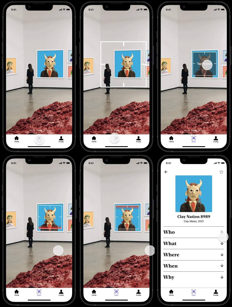
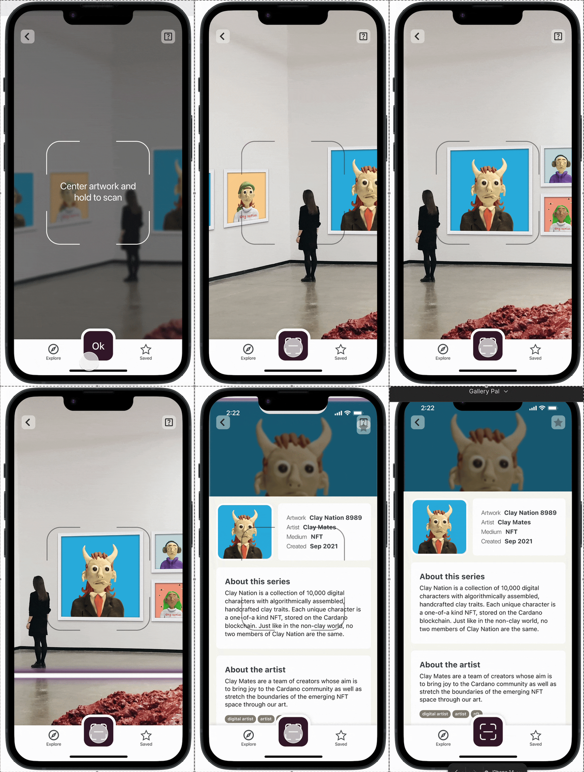
My biggest challenge was designing the animation for the scanner, as it wasn't something I had ever done before! Luckily, my mentor helped me to reel it away from being too corny, which it was.
Scanner Animation V1
- Icons too small
- Mission Impossible aesthetic
- Slow


Scanner Animation V2
- Larger icons
- Instructions
- Full screen scan
- Scanner uses brand color
Day 5
User Testing
Research Method: User Testing
To test GalleryPal, I reached out to a couple friends and former colleagues who perfectly fit the target user base. I was most interested in whether the directions for accessing an artwork's information were clear.
Observations
- Users commented that the transitions lagged, so we will need to speed those up in the future.
- It was not immediately clear to users how to get to the scanning page from the museum page.
- Users also expressed wanting more kinds of information on the artwork landing page, which could be its own design sprint for another time!
Looking Forward
Now that we have a user tested prototype, I'd be interested in exploring how to create the best experience for the artwork landing page. Our user interests vary and they want more information for different reasons. How might we create a landing page that is tailored to each users interests?


