Breed Specific
Dog Rescue
A Leg Up, iOS Mobile App, 2022
My Role
UX Research, UX Design, UI Design, Branding
Tools
Figma, FigJam, Marvel

Background
My rescue dog is a poodle-mix, and it is a miracle that I got her.
Olive was born with medical issues due to unethical breeding practices and was surrendered to a poodle rescue to get the surgery and care she needed. Due to the popularity of the breed, dogs from this rescue often receive over 100 applications😅
The only leg up I had was that I was a long-standing volunteer, and Olive was my foster dog. For those without this benefit, the process of rescuing a popular dog breed is much more difficult.
Context
A Leg Up makes rescue an easier process for those who want a specific breed of dog
Most do not expect to compete with hundreds of other applicants when they apply for a rescue dog. However, this is the case for many breed-specific rescues because demand is higher for popular dog breeds.
A Leg Up is an app that streamlines and tracks the application process, making it more transparent and predictable.
Problem
Applicants feel increasingly unmotivated to rescue
Applicants at breed-specific rescues often have an expectation that the process will be quick and straight-forward. It rarely is. This is a problem because it results in frustration, distrust, and ultimately, the applicant moves on to other options.
Solution
Increase Transparency
- Clear messaging
- Message of the day on the home page
Set Clear Expectations
- Analytics displayed for each dog and rescue
- Application dashboard


Streamline Process
- User fills application out one time and can adjust per dog if needed.
Clean and Professional UI
- Reduce visual clutter
The Process
Understanding the User
Misconception and frustration abound
Research Method: Observation, Immersion, Interviews
I am a part of the social media team for a poodle rescue. As such, I am in direct contact with their audience. Since any information gathered would be specific to poodle rescues, I also sent a screener to a wide range of people to identify other user types to interview. Through these interviews, as well as my observations and interactions through the rescue, I collected information about our user.


Key Takeaway
- Users are predominately women between 25-45 years old.
- There is a common belief that rescue should be easier than it is.
- Motivation to get a particular breed ranges from allergies to preference.
- Predictability is highly valued.
- Users generally believe rescue is the right thing to do, but can change their minds when the process becomes more difficult than expected.
Defining the User
The Suburban Mom.
The Try-To-Do-Gooder.
Activity/Deliverable: Affinity Map, Empathy Map, Personas
I used affinity and empathy mapping to distill the information collected, and two distinct user types became apparent: The Suburban Mom, and The Try-To-Do-Gooder. While they have a shared goal to find a specific kind of dog, a key difference is that one user type’s frustration stems from a lack of control, and the other from a lack of information.


Locating the Problem
Search. Apply. Rejection. Repeat.
Activity/Deliverable: Journey Map
Though each user-type has varying frustrations, their core problem is the same. My "aha!" moment came as I tracked their journey and found that both users get caught in the same loop during their search for a dog.

LoFi Solutions
HMW set better expectations?
HMW create more transparency?
HMW increase efficiency?
Activity/Deliverable: Mind Map, User Flows
The users goal is to find a dog. The problem? The Loop of Despair. Since it is not possible to remove this loop altogether, the goal became how to better equip users for it, and to make it less... despairing.
I first created a mind map to brainstorm as many possible solutions to our HMW questions. From there, I narrowed down solution ideas to those that would fit within a minimum viable product.
Red Routes
1. Create a profile
2. Apply for a dog


LoFi Testing
Feedback from strangers in a coffee shop
Research Method: Guerrilla Testing
I used a simple Marvel prototype created with sketches of each screen to do my first round of usability tests. I go to the same coffee shop nearly every day to work from my computer, so it was easy enough to find a few locals to test this first iteration of screens.

Key Takeaway
- Navigation and progress through onboarding is not clear.
- There is no possibility to create a profile later. What if the user wants to browse dogs before committing to the app?
- The section to review application before submitting it for a dog is confusing.
HiFi Solutions
Hypothesis: Efficiency will increase if application is included in profile setup
Activity/Deliverable: HiFi Screens, Prototype
For the first iteration of hifi screens, I focused on clear navigation and messaging, as well as giving the user more control. In order to solve for our user needing more transparency, I was most interested in testing the application tracker on the home screen.

HiFi Testing
Need to clean up visual clutter, clunky transitions, and redundant information
Research Method: User Testing
Most user feedback dealt with areas that could be more streamlined, or where the UI was a little clunky. I also hypothesized that more visual contrast would help break up elements that got lost in the first round of usability tests, and so I re-imagined the brand.
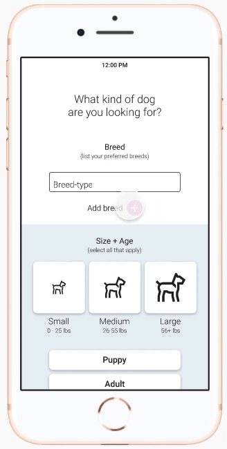
Issue #1
Forms for Add Breed / Add Member
The size and design of the add button made it too subtle to register visual feedback when it changes states. This resulted in confusion about how to submit the information.
Solution: Provide more feedback, and break up the onboarding sequence to reduce visual clutter.


Issue #2
Review application
When it was time for the user to review their application, it was not clear that it was already populated with their answers. Multiple users thought they had to fill out the form again.
Solution: redesign so that all the information is displayed above the fold, with the option to click into each section to edit.
Final Test and Revisions
Revised UI and simplified Review Application screen solved major user issues
Research Method: User Testing
Though this round of testing solved for many of the most pressing user issues, there was still feedback I would attend to if there were time. The Getting to Know You section of the application is a little sticky, and the progress indicator on the home page might benefit from a popup message or more prominent visual feedback.

Looking Forward
- I'd like to spend more time on illustrative elements and use them to create a more interesting onboarding sequence.
- In real life, rescues have far more questions on their applications. For this to be a successful platform we'd need to research and design from the rescue's perspective as well.